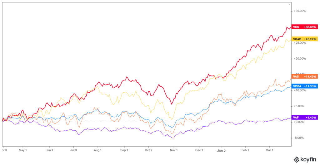
Our first chart in this update shows the 12 month returns for some of the major markets that investors generally have exposure to. (we use these common exchange traded funds as ‘proxies’ for the underlying markets as the data is available in a more timely manner) The standout is the code VGS, which tracks the MSCI World Index. Up 30.06% including dividends, that is a mighty return, trailed slightly by the Vanguard MSCI World index hedged back into AUD. The lower 26.24% return reflects the amount that the AUD has fallen versus those other global currencies.

In the orange line, the Australian Shares index represented by the Vanguard ETF (VAS), shows a gain of 14.43% for the period, again including dividends. Tracking the purple line is the Vanguard Australian Fixed Interest ETF (VAF). Its return was a mere 1.49% over the period.
Of course, the last 12 months was coming off a fairly low base, providing what we call a ‘favourable comp’ meaning that the prior period ended at or close to a low point. The S&P500 declined by 9.29% in the year to 31 March 2023, so arguably was due for a bounce. In the year since, the S&P500 is up 29.66%.
One more thing that is apparent when you look at a time series chart like this, is that you see when the mood changed. It is quite obvious that something happened in late October and early November.
What Changed? – Interest rates
Towards the end of October 2023, longer term rates were still accelerating higher.
However, suddenly at the start of November things changed. The 1st of November Federal Open Markets Committee meeting minutes hinted that they had done enough tightening, and acknowledged that the effects of previous interest rate hikes were still feeding into the system. Shortly after, the US Producer Price Index (PPI-FD), which had been rising for the three months prior, fell (more than expected) by 0.5% for the month of October, while the one year PPI final demand number moderated to 1.3%.

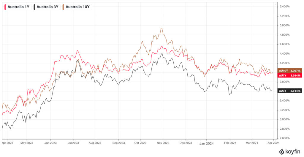
As can be seen above, Australian bonds took a lead from the US, and rates here also peaked in October, and have been generally falling since. We are of course speaking about the rates for longer term bonds, the chart shows 1 year, 3 year and 10 year bond yields.
Unlike the Official Cash Rate, the longer term rates are generally determined by the participants in the bond markets. The exception to this was the period from March 2020 to February 2022 when the Australian Reserve Bank intervened with a stated objective of keeping the 3 year government bond rate pinned at 0.10%. (Also known as Yield Curve Control)
The free-floating part of the rate market gives us an indication of what the market participants think about the balance of future inflation, interest rates, and the health of the economy.
Normally longer term interest rates are higher than short term. This makes sense because locking into a fixed rate for a longer period, you would want to have a higher compensation for the risk that inflation gets out of control.
The gentle upward slope we ‘normally’ observe as time to maturity increases is called the Yield Curve.
However, the times we live in are anything but normal.
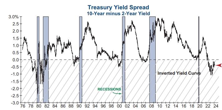
Back in July 2022 the normal US yield curve became an Inverted Yield Curve. Inverted, meaning that the short term rates were higher than the longer term rates. Rates in the US have remained ‘inverted’ ever since. In Australia our 2 year bond yield went above the 10 year yield in June 2023. This is usually a reliable indicator that a recession is just around the corner. Normally within 6 to 18 months.

As yet we have had no recession.
Does that mean this time is different? That’s a question I have been asking myself as the current bull run continues. Could the way that monetary policy has been applied have changed the outcomes? Have market participants changed their responses? Like Pavlov’s dogs, do they now salivate at just the sound of the bell ringing?
We must remain open to the possibility that markets are (somewhat) different. If they are indeed different, we would be missing out on return opportunities if we continue to believe the economy is poised for a recession just because the Yield Curve says so.
However the InvesTech chart above, with the grey bars showing a recession after every yield Curve inversion, has a solid track record of forecasting.
Economic Juice
One of the contributing factors to continued strength, especially in the US economy, has been deficit spending.
The US Congressional Budget Office expected debt to increase by $1.6 trillion during 2024. However, from 27/9/2023 to 19/03/2024 the debt has already increased by $1.4 trillion. That took less than six months!
So it is probably no wonder the economy has ticked along very well. Spending more than you earn always makes the household members feel good!
The Economic Juice has also helped to drive sharemarkets higher. However a lot of the gains were concentrated in a narrow group of leading stocks. In the 2021 bull market it was the FAANGS, but the latest label for the leading stocks is the Magnificent 7, including most of the FAANG and adding Tesla and Nvidia. The latter has become a market darling through the mania with AI, and the ability of Nvidia chips to outperform most others in this functionality.
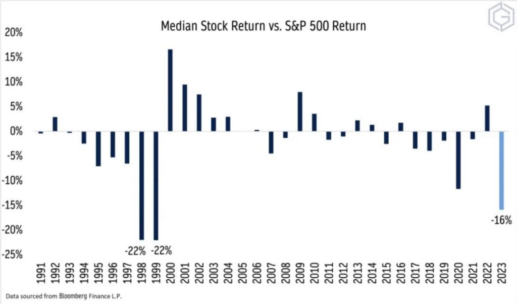
Our next chart from http://dailychartbook.com illustrates this quite well.

The dispersion between the S&P500 and the ‘median’ stock (ie; return from the stock with the middle performance) is at an extreme not seen in 23 years.
Yes, that previous euphoric period was the Tech Bubble. That correlation also gives us reason for caution. US Tech made up 33% of the US index back in 2000, and is at the same percentage today. No doubt this time could be different. However, there are good reasons for concern.
An alternative ending is that this bubble could inflate even further. If you look at the ’98 to ’99 experience, the second year was just as much of a divergence as the market went ever higher into the final peak in March 2000.
It is possible the S&P500 could repeat with another 30% up year. But one would think that would certainly be followed by a similar lost decade as was experienced in the 2000’s. Most people forget that period, especially now on the back of 14 years of mostly solid returns.
What else is of concern?
Property
Not the Australian residential property market. At least not just yet. It seems there is still enough trickle up effect from the current migration to keep prices firm in the market for houses and units.
We are concerned about the impacts from declining Commercial Property values, and in particular reports out of the USA.
In Washinton DC a tower at 1101 Vermont Ave sold for $16 million recently. It was valued at $72 million in 2018.
In downtown LA, a 1 million square foot office tower was just sold for $145 million. The seller was Brookfield who owed $289 million in debt on the property. You can bet they paid more than that for it.
In Oakland Florida, Starwood Group paid $500 million for three office buildings five years ago. In March 2024 they defaulted on a $364 million loan and have lost control of the properties. There is no sign of a sale price, but the lender was Deutsche Bank.
Remember that it was the surprise number of sub-prime borrowers in the mortgage backed securities in two Bear Stearns hedge funds that was the opening act in the 2008 Global Financial Crisis. The crisis of confidence that followed soon revealed lots of other naked swimmers, to use a Buffett analogy.
So far none of that seems to have mattered to markets in general.
But these are factors to keep in mind when your adviser suggests trimming back some of your exposures, rather than chasing last year’s winners.
Stay safe and never be complacent.

